Range Section
Description
The Range Section is a component for displaying PMI products.
Range types:
- Range: A Range Section that displays a column per product with a flex scroll behavior in tablet/mobile.
Range
Configuration
Title + Description
Create a new Section in the content builder.
Add a HTML Markup Widget inside the section with the following code:
<input
       name="open-section"
       data-section="title-description"
       data-name="title-description"
       value="title-description"
/>
Add a Rich Content Editor inside the section.
The Section title must be a Heading 2, and the subheadline must have the predefined format.

Usage
After including the HTML Markup Widget to inform that the specific element is a Title + Description Widget, various css classes can be added to value in order to costumize it.
Background Colors:
bg-red
bg-deep-red
bg-turquoise
bg-blue
bg-deep-blue
bg-amber
bg-cream
bg-slate
bg-slate-15
bg-soft-white
Font color:
font-slate
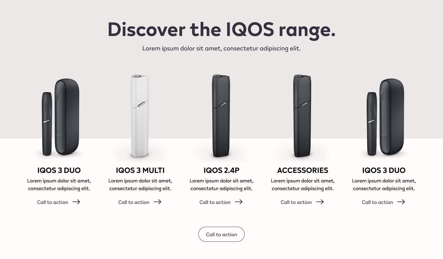
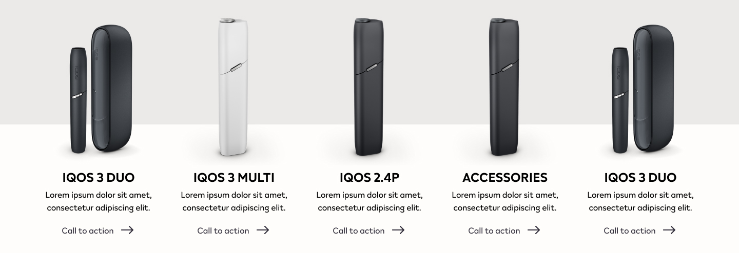
Range Grid
Create a new Section in the content builder, choose the number of columns and add the content below:
Add a HTML Markup Widget inside the section with the following code:
<input
       name="open-section"
       data-section="range"
       data-name="range"
       value="range"
/>
Add two Rich Content Editor Widget per column. One for the product image and for the copy.
The Product name must be a Heading 3, and the short description must have the predefined format.
Use the predefined font format and add a link anchor to the designated page.
Usage
After including the HTML Markup Widget to inform that the specific element is a Range Widget, various css classes can be added to value in order to costumize it.
Background Colors:
bg-red
Overlay Colors:
overlay-red
Font Color:
font-slate
Number of Elements:
range-two (for displaying two products only) range-three (for displaying three products only)
When using the class range-two, choose the 4 column layout in the builder, using just the two center for content, the outer columns must be left empty. When using the class range-thre, chosse the 3 column layout in the builder and insert a product per column.
Range Call-to-action
Create a new Section in the content builder, choose the number of columns and add the content below:
Add a HTML Markup Widget inside the section with the following code:
<input
       name="open-section"
       data-section="buttons"
       data-name="buttons"
       value="buttons"
/>
Add a Rich Content Editor inside the section. Use the predefined font format for the call-to-action copy and add a link anchor to the designated page.

Usage
After including the HTML Markup Widget to inform that the specific element is a call-to-action widget, various css classes can be added to value in order to costumize it.
Background Colors:
bg-red
Button Style:
btn
btn-outline
btn-invert
btn-color