DOCS configuration
Overview
PMI OPEN DOCS is a documentation repository powered by Nextra, a static site generator framework. In order to get the best experience editing the documentation, markdow knowledge is required.
For full Markdown documentation see this link: MDX Basic Syntax (opens in a new tab).
Rendering Tags:
Titles:
To render a h1 use, # Heading
To render a h2 use, ## Heading
To render a h3 use, ### Heading
To render a h4 use, #### Heading
To render a h5 use, ##### Heading
To render a h6 use, ###### Heading
Bold:
To render a bold text use, **bold text**
the next word is in bold text.
Italic:
To render a italic text use, _italic_
The next word is in italic.
Combine Italic and Bold:
To render a combined italic and bold text use, **_both_**
The next word uses both.
Blockquotes
To render a blockquote use, > text goes here
This phrase is in blockquotes.
Multi paragraph Blockquotes
To render a Multi paragraph Blockquote use,

> This phrase is in blockquotes.
>
> This phrase is also in blockquotes.
This phrase is in blockquotes.
This phrase is also in blockquotes.
Ordered List
To render a ordered List use,

1. First item
2. Second item
3. Third item
   1. inner item
   2. inner item
4. Fourth item- First item
- Second item
- Third item
- inner item
- inner item
- Fourth item
Unordered List
To render a unordered List use,

- First item
- Second item
- Third item

- inner item- First item
- Second item
- Third item
- inner item
Code
Can be used tfor referencing usable code using content inside a ``` ```, it will rende as line below.
<code goes here>Horizontal Rules
Use the following syntax to render a horizontal rules ---
Links
Used the following syntax [sample link](https://www.wundermanthompson.com/).
Can navigate using sample link (opens in a new tab).
Images
To render an image use  <Image src="/img/sections/teste.png" alt="" width={850} height={500} />
Images are not previwable in vscode, you can add the following path "/docs/public/"
before the correct url in order  to view them in the preview.

DOCS best practice Configuration
Folow the structure below in order to mantain a coherent layout in every page created.
- copy/paste the code below as it is and insert it in the new pages.
- this examples is only for knowing the structure, don't mind with the content itself.
- the Usage block is used to reference all the styling classe that can be used in the input.
Component Widget
Description
Use it to describe how the widget is used in the OPEN website
Component Widget types:
- Component Widget type one: If the widget can be created in the builder with different native widgets (example: using rich content or articles). Reference the widget used and possibly builder widget configuration.
Component Widget type one
image display to overview the whole component, 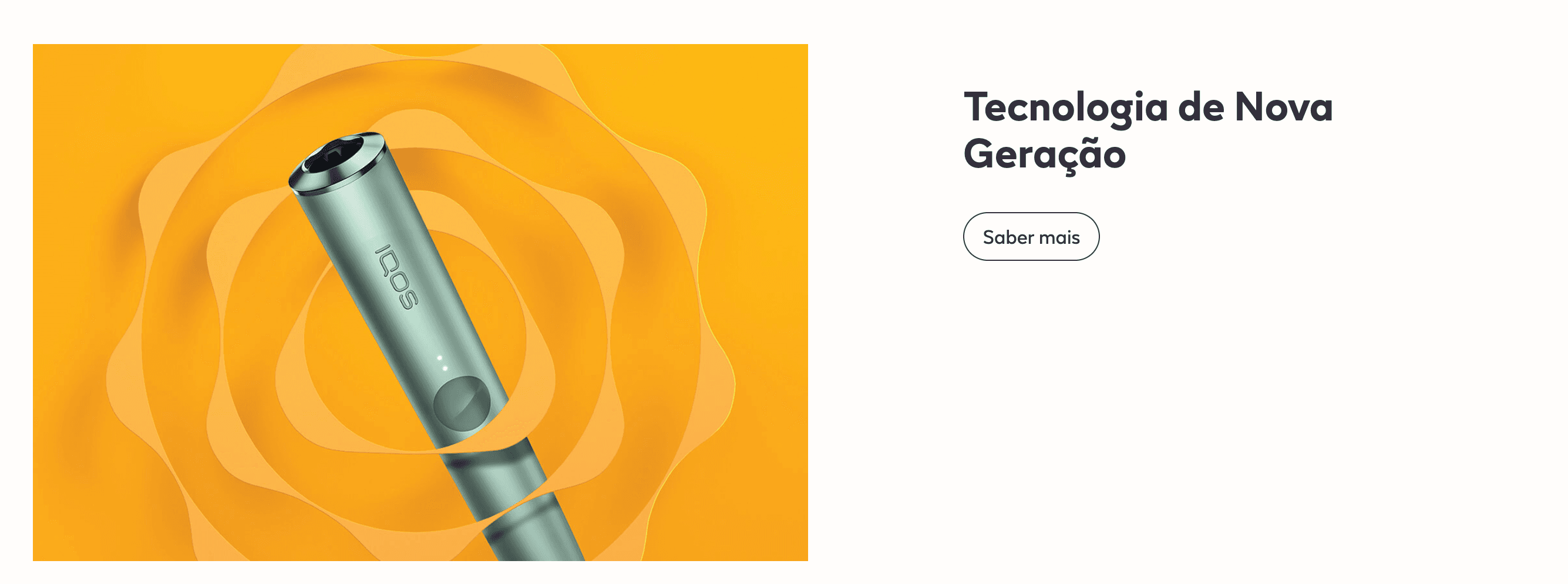
Create a new Section in the content builder.
Add a HTML Markup Widget inside the section with the following code:
<input
       name="open-section"
       data-section="componentName"
       value="componentClasses"
/>
Add a Rich Content Editor inside the section for optional block description
The copy must be a Heading 3.
Add A Recent Content Widget inside the section and insert the expected tags(create in backend) in order to display the quote.
Usage
After including the HTML Markup Widget to inform that the specific element is a Title + Description Widget, various css classes can be added to value in order to costumize it.
The background color of this section is soft-white by default.
Font color:
font-slate
font-deep-blue
font-blue
font-deep-red
font-red
font-amber
font-yellow
Background Colors:
bg-red
bg-amber
bg-slate
bg-soft-white
Buttons:
btn - 
btn-invert - 
btn-outline - 
Layout:
small: Affects the component max width, for tableto to desktop viewport.
full: Affect the image behaviour of the component, placing it as a full
background image, with overlay copy.
first-module: Can be used to erase the default top margin of the component.