Carrousel Blocks
Description
The Carrousel Widget is a component for cycling through elements.
Carrousel types:
- Carrousel-full: A Carrousel Widget that occupies the entire width of the page (100%).
- Carrousel-grid DTE Recent Content Widget: A Carrousel Widget that uses a DTE Recent Content Widget to import content from the backend.
- Carrousel-grid DTE Article Widget: A Carrousel Widget that uses DTE Article Widgets to display content in a grid layout.
Carrousel-Full
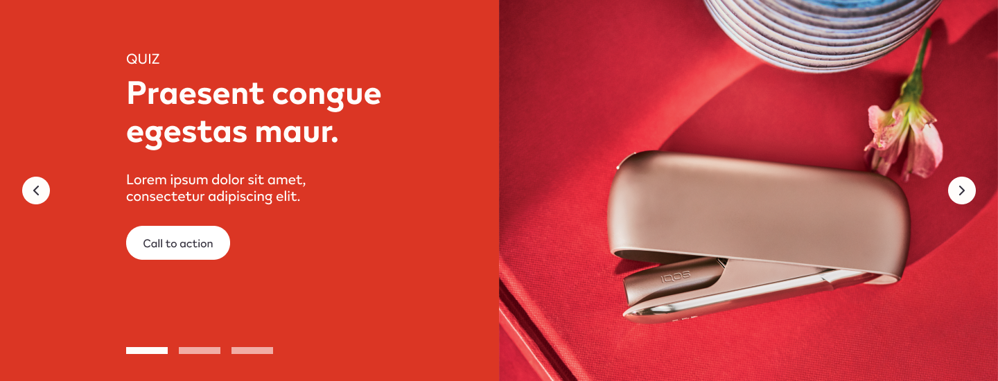
Configuration
Add the HTML Markup with this code:
<input
       name="open-section"
       data-section="carrousel"
       value="carrousel-full"
/>
Usage
After including the HTML Markup to inform that the specific element is a Carrousel Widget, various css classes can be added to value in order to costumize it.
Background Colors:
bg-red
bg-deep-red
bg-turquoise
bg-blue
bg-deep-blue
bg-amber
bg-cream
bg-slate
bg-slate-15
Font and Carrousel indicators color:
font-slate
Button Types:
With font-slate base class:
btn
btn-outline
btn-arrow-slate
With font-soft-white base class:
btn
btn-outline
btn-arrow-soft-white
Carrousel-Grid DTE Recent Content Widget

Configuration
Create a new Section in the content builder and add the content below:
Add the HTML Markup Widget with the following code:
<input
       name="open-section"
       data-section="carrousel"
       value="carrousel-grid"
/>
Add a Rich Content Editor Widget to create the headline e subheadline copy.
The Headline must be a Heading 2, and the subheadline must have the predefined format.

Add a DTE Recent Content Widget for the Carrousel Grid.
Add a Rich Content Editor Widget to create the call-to-action button. Use the predefined font format and add a link anchor to the designated page.

Usage
After including the HTML Markup to inform that the specific element is a Carrousel Widget, various css classes can be added to value in order to costumize it.
Font color:
font-slate
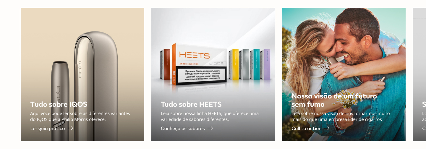
Carrousel-Grid DTE Article Widget
Configuration
Title + Description
Create a new Section in the content builder.
Add a HTML Markup Widget inside the section with the following code:
<input
       name="open-section"
       data-section="title-description"
       data-name="title-description"
       value="title-description"
/>
Add a Rich Content Editor inside the section.
The Section title must be a Heading 2, and the subheadline must have the predefined format.

Usage
After including the HTML Markup Widget to inform that the specific element is a Title + Description Widget, various css classes can be added to value in order to costumize it.
Background Colors:
bg-red
bg-soft-white
Font color:
font-slate
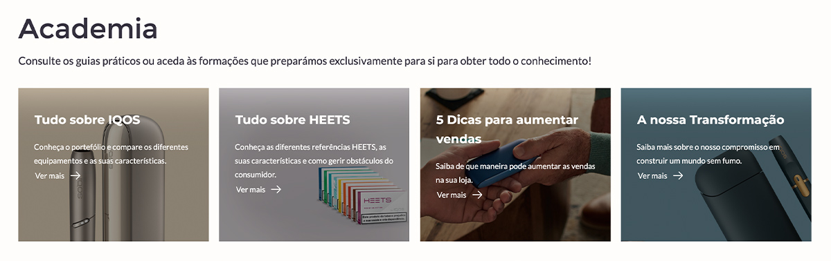
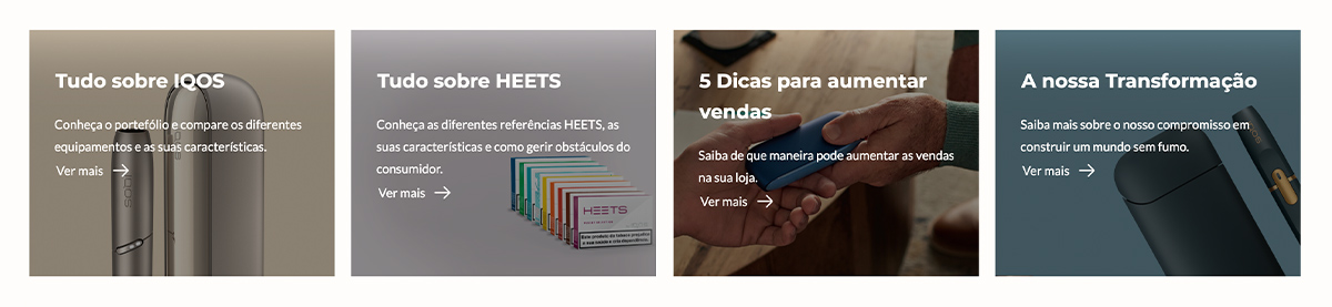
Carrousel Grid
Create a new Section in the content builder, select the four columns layout and insert the content below:
Add the HTML Markup Widget with the following code in the first column:
<input
       name="open-section"
       data-section="carrousel"
       value="carrousel-grid article"
/>
Add a DTE Artcle Widget for every column with content, and insert the correct Article number (created in the backend).
Usage
After including the HTML Markup to inform that the specific element is a Carrousel Widget, various css classes can be added to value in order to costumize it.
Font color:
font-slate
Carrousel Grid call-to-action
Optionally, Create a new Section in the content builder, choose the full-width column layout and add the content below:
Add a HTML Markup Widget inside the section with the following code:
<input
       name="open-section"
       data-section="buttons"
       data-name="buttons"
       value="buttons"
/>
Add a Rich Content Editor inside the section. Use the predefined font format for the call-to-action copy and add a link anchor to the designated page.

Usage
After including the HTML Markup Widget to inform that the specific element is a call-to-action widget, various css classes can be added to value in order to costumize it.
Background Colors:
bg-red
Button Types:
btn