Featured Banner
Description
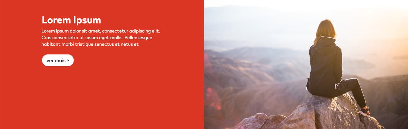
The Featured Banner component is use for displaying two columns of content, a copy container and a image container.
Featured Banner Widget types:
- Featured Banner DTE Recent Content: A Widget that displays two columns using the DTE Recent Content to import content from the backend as articles.
- Featured Banner Quiz: A Widget that displays two columns using the DTE Recent Content or DTE My Feedback to import content from the backend as quiz.
- Featured Banner DTE Article: A Widget that uses Article widgets to add content from the backend.
- Featured Banner Rich Content: A Widget that uses Rich Content widgets to adds content directly to the builder.
Featured Banner DTE Recent Content
Configuration
Create a new Section in the content builder and select full column layout.
Add a HTML Markup Widget inside the section with the following code:
<input
       name="open-section"
       data-section="Featured Banners"
       data-name="Featured Banners"
       value="featured-banners"
/>
Add a DTE Recent Content widget inside the section to import the respective content from the backend, using the type article.
Usage
After including the HTML Markup Widget to inform that the specific element is a Featured Banner DTE Recent Content, various css classes can be added to value in order to costumize it.
Background Colors:
bg-red
bg-deep-red
bg-turquoise
bg-blue
bg-deep-blue
bg-amber
bg-cream
bg-slate
bg-slate-15
bg-soft-white
Font color:
font-slate
Buttons:
btn
btn-invert
btn-outline
Layout:
small: affects the component max width, for tableto to desktop viewport. full: affect the image behaviour of the component, placing it as a full background image, with overlay copy. first-module: Can be used to erase the default top margin of the component. flex-align: Can be used to middle align the copy in the container. The default value is used for copy content on the left container. If the copy is on the right container, and flex-align is an active class, the class
rgtmust be also used, to prevent layout errors.
Addons:
tick-bg-[color]: Can be used to display a tick icon in the image container. Besides choosing a different color for the background based on the guidelines colors, the tick icon can use
tick-slateortick-soft-white.
Featured Banner Quiz

Configuration
Create a new Section in the content builder and select full column layout.
Add a HTML Markup Widget inside the section with the following code:
<input
       name="open-section"
       data-section="Featured Banners"
       data-name="Featured Banners"
       value="featured-banners quiz"
/>
Add the respective widget inside the section to import the content from the backend, using the type quiz.
Usage
After including the HTML Markup Widget to inform that the specific element is a Featured Banner DTE Recent Content, various css classes can be added to value in order to costumize it.
Background Colors:
bg-red
Font color:
font-slate
Layout:
small: Affects the component max width, for tableto to desktop viewport.
full: Affect the image behaviour of the component, placing it as a full background image, with overlay copy.
first-module: Can be used to erase the default top margin of the component.
quiz-full: Layout variation using two columns instead of a full column. Each column displays a quizz, with a full background image.\
Addons:
program: Is used to display below the quiz component, a block with information. The font color of this section can be changed to
font-soft-whiteorfont-slate.
Featured Banner DTE Article
Configuration
Create a new Section in the content builder and select full column layout.
Add a HTML Markup Widget inside the section with the following code:
<input
       name="open-section"
       data-section="Featured Banners"
       data-name="Featured Banners"
       value="featured-banners article"
/>
Add a DTE Article Widet inside the section to import the respective content from the backend.
Usage
After including the HTML Markup Widget to inform that the specific element is a Featured Banner DTE Recent Content, various css classes can be added to value in order to costumize it.
Background Colors:
bg-red
Font color:
font-slate
Buttons:
btn
Layout:
small: affects the component max width, for tableto to desktop viewport.
full: affect the image behaviour of the component, placing it as a full background image, with overlay copy.
first-module: Can be used to erase the default top margin of the component.
flex-align: Can be used to middle align the copy in the container. The default value is used for copy content on the left container. If the copy is on the right container, and flex-align is an active class, the classrgtmust be also used, to prevent layout errors.
full-display
Featured Banner Rich Content
Configuration
Create a new Section in the content builder and select two column layout.
Add a HTML Markup Widget inside the section with the following code:
<input
       name="open-section"
       data-section="Featured Banners"
       data-name="Featured Banners"
       value="featured-banners rich"
/>
Add a Rich content widget inside each section, one column for copy and another for the image.
Usage
After including the HTML Markup Widget to inform that the specific element is a Featured Banner Rich Content, various css classes can be added to value in order to costumize it.
Background Colors:
bg-red
Font color:
font-slate
Buttons:
single-cta - to use a single call-to-action inside the copy container. The classes below can be used to format the button:

btn
btn-arrow-slate btn-arrow-soft-white
double-cta - used to display two align call-to-action buttons. the layou of this component is locked by default.

Layout:
small: affects the component max width, for tableto to desktop viewport.
full: affect the image behaviour of the component, placing it as a full background image, with overlay copy.
first-module: Can be used to erase the default top margin of the component.
flex-align: Can be used to middle align the copy in the container. The default value is used for copy content on the left container. If the copy is on the right container, and flex-align is an active class, the classrgtmust be also used, to prevent layout errors.
height-max: Ajust container max-height to 300px;
overlay : Ajust the mobile layout to use full background image and overlay copy. Must uselftorrgtfor copy variation.